
Zuyd Hogeschool
Data visualisation workshop
Welcome!
Topics we will cover

The superpowers and limitations of our visual brain
We will discuss the things we are good ànd less good at when it comes to visual information processing

The three visualization lenses
These three lenses give you a framework for looking at and assessing the quality of a visualization. That, in turn, will help you create effective, clear, and attractive visualizations yourself!

Everything starts with a story
There are infinite possibilities to visualize even just two numbers! It is therefore of importance to clarify the story first. We will look at how to find a story first, and then tell it to your audience.

Mental framework to reach your audience
There is not one single route to the perfect data visualization. This framework by Alli Torban helps determine the different ways in which your audience may receive your visualization, and how you can adjust your design accordingly.
Workshop slides
Slides can be downloaded below:
What chart type to use?
There is lots of help for that! Pick one that suits your needs best from the options below:

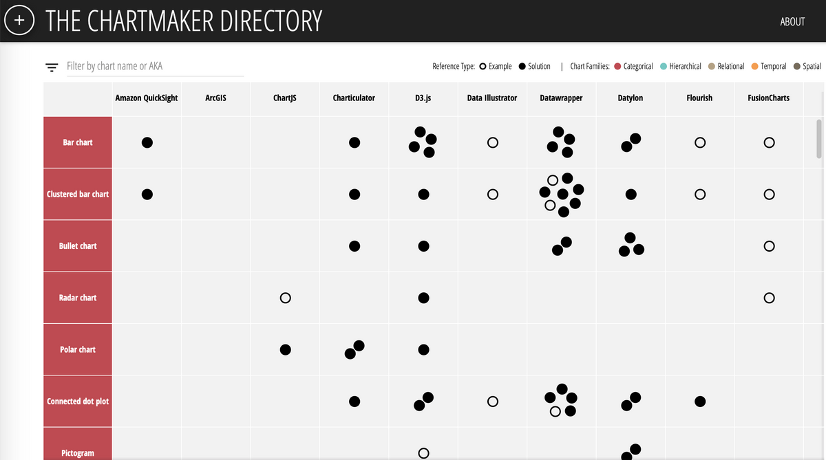
How to create this specific chart with software/tool X or Y?
So you know what you want to make and also which tool you want to do that with.... but you're not really sure how. There's help for that: Chartmaker links you to blogs, formats etc, per tool and type of visualisation!

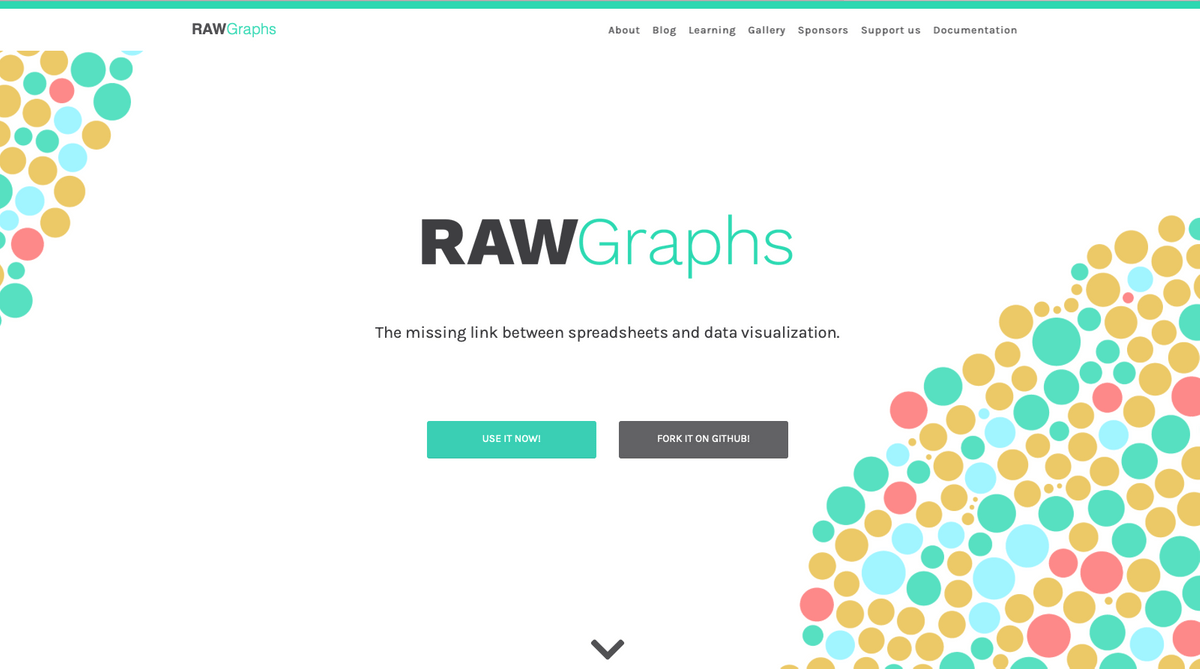
How to create relatively non-standard visualisations, quickly?
In Rawgraphs you can upload your data, and visualize it in ways that are just outside of the 'standard Excel' realm, like Sankey plots, streamgraphs, etc.
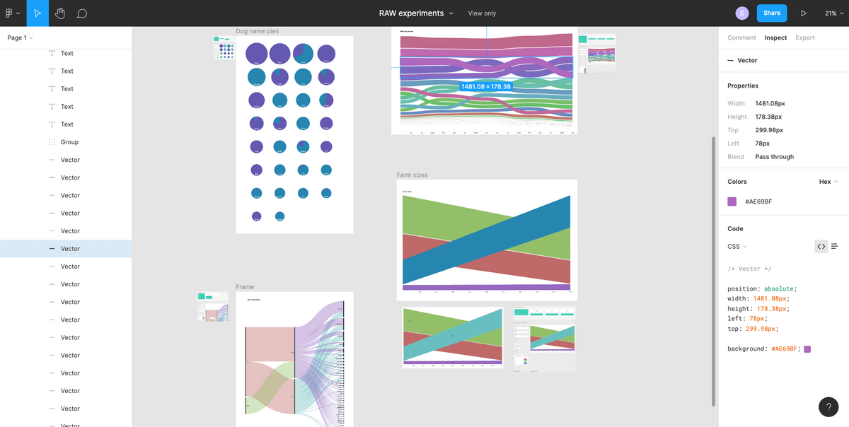
The output of Rawgraphs is not 'polished' or 'final', but you can export it as a SVG file, which you can then finalise in Adobe Illustrator or.... (see next recommendation) using the online drawing/design platform Figma.

How do I make the last 'tweaks' to my visualisation?
Figma is a free, online design program for people who do not have Adobe Illustrator, but still want to polish their 'rough' SVG files (for example Rawgraphs' output, see previous point). You do need to register to create an account.
Topics that came up in the workshop
People working on the academic side of data visualisation
- Enrico Bertini - https://enrico.bertini.io/
- Lace Padilla - https://www.lacepadilla.com/
- Jessica Hullman - http://users.eecs.northwestern.edu/~jhullman/
- Jack van Wijk @ TUe - https://www.tue.nl/en/research/researchers/jack-van-wijk
- Steve Haroz - http://steveharoz.com
Extra information, references, tips, etc.
Background information and recommendations
Inspiration - visualizing a single data set in many different ways
Inspiration - people who turn data into art
- Moritz Stefaner - https://truth-and-beauty.net
- Nadieh Bremer - https://www.visualcinnamon.com
- Sonja Kuijpers - https://www.studioterp.nl
Great Design is not one single big insight. It is rather a million little steps in (sort of) the right direction...
- Andy Kirk has created a list of all the small choices that can contribute to a great visual communication piece. Good to browse through to appreciate the small (and often simple!) choices behind good design - https://visualisingdata.com/2016/03/little-visualisation-design/
Book recommendations
- Edward Tufte - The Visual Display of Quantitative Information - The 'founding' book of data visualization. Must read for scientists.
- Cole Nusbaumer Knafflic - Storytelling with data - Data vis from a BI perspective: how to effectively communicate with impact using stand-alone data visuals?
- Alberto Cairo - The Functional Art - Data vis from an infographics & journalism perspective: how to capture complex information in understandable visuals for broader audiences.
Scientific articles on data vis
- Karen Cheng et al. - Proving the value of visual design in scientific communication - Information Design Journal 23(1), 2017
- Danielle Szafir et al. - Four types of ensemble coding in data visualizations - Journal of Vision (2016) 16(5):11, 1–19 1
- Fabio Crameri et al. - The misuse of colour in science communication - Nature Communications (2020) 11:5444
- Bang Wong - Points of View part 2: Color and quantitative data - Nature Methods March 2011
- Tracey Weissgerber - Reveal, don't conceal - Circulation. 2019;140:1506–1518
Conferences and talks
- Outlier - Relatively new online conference, organised by the Data Visualization Society - https://outlierconf.com
- OpenVis - Unfortunately this one has stopped after a few editions. Very much worth to check out presentations on their website or YouTube.
- Infographic Congres - Live conference in The Netherlands, a bit more focussed on journalism/infographics - https://www.infographicscongres.eu
- SciVizNYC - Focussed on scientific visualisations - https://www.sciviz.nyc
- Steve Franconeri @ OpenVis 2018 - Very interesting presentation on visual cognition: how does our brain process visual information, what is it good/bad at?
Color help!
Read about it:
- A great blog and good starting point on what to consider when making color choices is written by Lisa Charlotte Rost - https://blog.datawrapper.de/which-color-scale-to-use-in-data-vis/
Create palettes yourself:
- Color picker - A nice tool to create three different types of color palettes: visually equidistant palettes, divergent palettes, and single hue palettes - https://www.learnui.design/tools/data-color-picker.html
- Cooler.co - A very good and accessible tool to explore and create color palettes. You can also derive color palettes from images with this tool, and check for grayscale readability, colorblindness, etc. https://coolors.co
Colorblindness and color contrast checkers:
- Colororacle - Program to be downloaded. Turns your computer screen into a colorscheme as seen by someone with colorblindness (also grayscales) - https://colororacle.org/
- Color contrast checker - Program to be downloaded. Use a dropper-tool to check the contrast between two colors - https://www.tpgi.com/color-contrast-checker/
- Online color contrast checker - https://colourcontrast.cc/
A bit more technical options:
- Chroma.js Color Palette Helper - Creating a color palette that is lightness corrected overall - https://gka.github.io/palettes/
- Colorpicker tool - This tool is a great way to get to know colorspace and play with different options (I recommend playing around with all the buttons and sliders on this page, and see what happens) The beauty of this tool is that the resulting color palettes are lightness corrected (meaning that when converted to grayscale, you still have a 'correct' ordering based on the lightness) - http://tristen.ca/hcl-picker/
- IwantHue - Creating a good looking color palettes mostly for categorical, distinct data sets - http://medialab.github.io/iwanthue/
Survey
Do let me know what was most valuable to you
About me
Sara Maria Sprinkhuizen
I am a physicist who fell in love with MRI scanners, which launched my path into academia and health care. After finalizing my PhD in MRI physics (Utrecht University, the Netherlands) I moved to Boston for a post-doc (Harvard Medical School, USA). Over the past years I have also actively pursued my personal interest in data visualizations, often amazed at all the knowledge on that topic that is not yet found within academia. With my health care, data analytics, and data visualization experience, I now provide human centered and tailor-made data support for health care organizations and scientists.

Contact
Here to help, happy to connect
Sara Maria Sprinkhuizen - the Data Vision Lab - © 2023


