• Data visualisation workshop supporting information


    TUe / EAISI

  • Topics we will cover

    broken image

    The superpowers and limitations of our visual brain

    We will discuss the things we are good ànd less good at when it comes to visual information processing

    broken image

    The three visualization lenses

    These three lenses give you a framework for looking at and assessing the quality of a visualization. In addition, it enriches the vocabulary with which you address certain characteristics of a data vis. That, in turn, will help you create effective, clear, and attractive visualizations yourself.

    broken image

    Everything starts with a story

    There are infinite possibilities to visualize even just two numbers! It is therefore of importance to clarify the story first. We will look at how to find a story first, and then tell it to your audience.

    broken image

    Mental framework to reach your audience

    There is not one single route to the perfect data visualization. This framework by Alli Torban helps determine the different ways in which your audience may receive your visualization, and how you can adjust your design accordingly.

  • What chart type to use?

    There is lots of help for that! Pick one that suits your needs best from the options below:

  • broken image

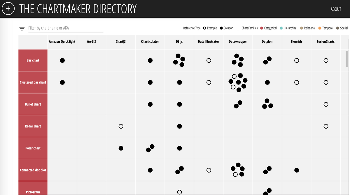
    How to create this specific chart with software/tool X or Y?

    So you know what you want to make and also which tool you want to do that with.... but you're not really sure how. There's help for that: Chartmaker links you to blogs, formats etc, per tool and type of visualisation!

    broken image

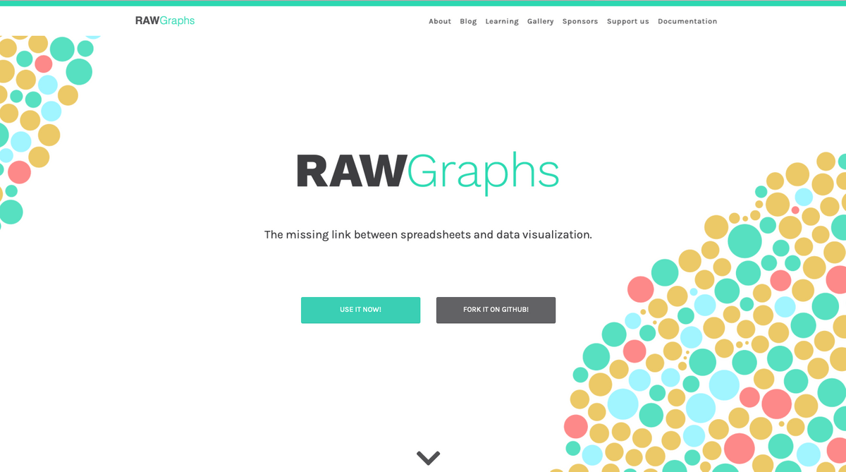
    How to create relatively non-standard visualisations, quickly?

    In Rawgraphs you can upload your data, and visualize it in ways that are just outside of the 'standard Excel' realm, like Sankey plots, streamgraphs, etc.


    The output of Rawgraphs is not 'polished' or 'final', but you can export it as a SVG file, which you can then finalise in Adobe Illustrator or.... (see next recommendation) using the online drawing/design platform Figma.

    broken image

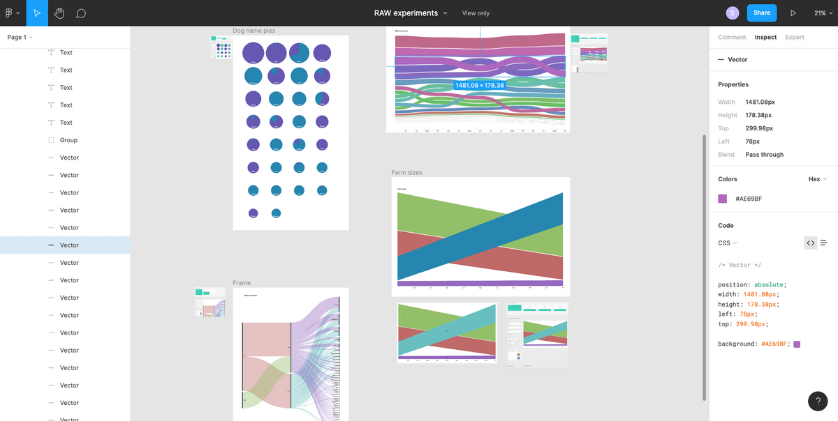
    How do I make the last 'tweaks' to my visualisation?

    Figma is a free, online design program for people who do not have Adobe Illustrator, but still want to polish their 'rough' SVG files (for example Rawgraphs' output, see previous point). You do need to register to create an account.

  • Extra information, references, tips, etc.

    Background information and recommendations

    Inspiration - people who turn data into art

     Inspiration - people who work on the academic side of data visualization

    • Enrico Bertini - https://enrico.bertini.io/
    • Lace Padilla - https://www.lacepadilla.com/
    • Jessica Hullman - http://users.eecs.northwestern.edu/~jhullman/
    • Jack van Wijk @ TUe - https://www.tue.nl/en/research/researchers/jack-van-wijk
    • Steve Haroz - http://steveharoz.com

    Great Design is not one single big insight. It is rather a million little steps in (sort of) the right direction...

    Book recommendations

    • Edward Tufte - The Visual Display of Quantitative Information - The 'founding' book of data visualization. Must read for scientists. 
    • Cole Nusbaumer Knafflic - Storytelling with data - Data vis from a BI perspective: how to effectively communicate with impact using stand-alone data visuals?
    • Alberto Cairo - The Functional Art - Data vis from an infographics & journalism perspective: how to capture complex information in understandable visuals for broader audiences.

    Scientific articles on data vis

    Conferences and talks

    • Outlier - Relatively new online conference, organised by the Data Visualization Society - https://outlierconf.com
    • OpenVis - Unfortunately this one has stopped after a few editions. Very much worth to check out presentations on their website or YouTube.
    • Infographic Congres - Live conference in The Netherlands, a bit more focussed on journalism/infographics - https://www.infographicscongres.eu
    • SciVizNYC - Focussed on scientific visualisations - https://www.sciviz.nyc
    • Steve Franconeri @ OpenVis 2018 - Very interesting presentation on visual cognition: how does our brain process visual information, what is it good/bad at?
    • Shan Carter at OpenVis conference, where (at 6 minutes in, lasting until minute 8), he shows an example of using (color) design and Gestalt principles to make equations more easily processable. The rest of the talk discusses viusally explaining machine learning.

    Color help!

    Read about it:


    Create palettes yourself:

    • Color picker - A nice tool to create three different types of color palettes: visually equidistant palettes, divergent palettes, and single hue palettes - https://www.learnui.design/tools/data-color-picker.html
    • Cooler.co - A very good and accessible tool to explore and create color palettes. You can also derive color palettes from images with this tool, and check for grayscale readability, colorblindness, etc. https://coolors.co


    Colorblindness and color contrast checkers:


    A bit more technical options:

    • Chroma.js Color Palette Helper - Creating a color palette that is lightness corrected overall - https://gka.github.io/palettes/
    • Colorpicker tool - This tool is a great way to get to know colorspace and play with different options (I recommend playing around with all the buttons and sliders on this page, and see what happens) The beauty of this tool is that the resulting color palettes are lightness corrected (meaning that when converted to grayscale, you still have a 'correct' ordering based on the lightness) - http://tristen.ca/hcl-picker/
    • IwantHue - Creating a good looking color palettes mostly for categorical, distinct data sets - http://medialab.github.io/iwanthue/
  •  

    About me

    Sara Maria Sprinkhuizen

    I am a physicist who fell in love with MRI scanners, which launched my path into academia and health care. After finalizing my PhD in MRI physics (Utrecht University, the Netherlands) I moved to Boston for a post-doc (Harvard Medical School, USA). Over the past years I have also actively pursued my personal interest in data visualizations, often amazed at all the knowledge on that topic that is not yet found within academia. With my health care, data analytics, and data visualization experience, I now provide human centered and tailor-made data support for health care organizations and scientists.

    broken image
  • Contact

    Here to help, happy to connect